The Challenge
Having previously partnered with the client to establish a Design System, the next phase focused on implementing it across their product suite. The client engaged us to support the design rollout across an initial six products, helping to stress test the system and ensure its effectiveness.
The Approach
Before implementing the Design System, we grounded the work in a clear problem statement.
Fragmented interfaces and inconsistent user experiences introduced real-world risk into the client’s products. Variations in menu patterns, modal behaviours, and core flows reduced predictability for nurses and clinicians, where even small points of friction could lead to errors.
Beyond usability challenges, the products were largely centred on data interpretation, yet the presentation was often unclear or ambiguous. This made it difficult to identify broader trends, for example, increases in falls were not always clearly surfaced.
These issues were compounded by the significant overlap between platforms. Medical professionals frequently moved between products covering compliance, incident reporting, analytics, and performance and appraisal, each part of a connected workflow, yet designed inconsistently and requiring separate onboarding and training.
Applying the Design System across the six different products also gave us the opportunity to improve aspects of the user experience, beyond the visual aesthetic, as well as ensuring the Design System had the requisite flexibility and scope to accommodate all use cases.
Tackling each product
We began with introductory sessions with each product’s Product Owners and Managers to better understand individual nuances and requirements. These sessions were complemented by in-depth product walkthroughs, where stakeholders shared key use cases, user types, goals, and primary journeys.
Following these sessions, the team mapped end-to-end user flows across each product, breaking them down into smaller sections to identify points of overlap.
To ensure a structured and manageable delivery, each section was treated as a standalone unit of work, comprising individual screens and smaller interaction flows. In total, this resulted in 1,046 sections mapped across the six products.
We then prioritised these sections with the client and worked through rebuilding them using the Design System’s components and styles. Throughout the process, we held regular check-ins with Product and Engineering to ensure alignment and manage expectations. Each section’s status was also tracked individually in Figma.
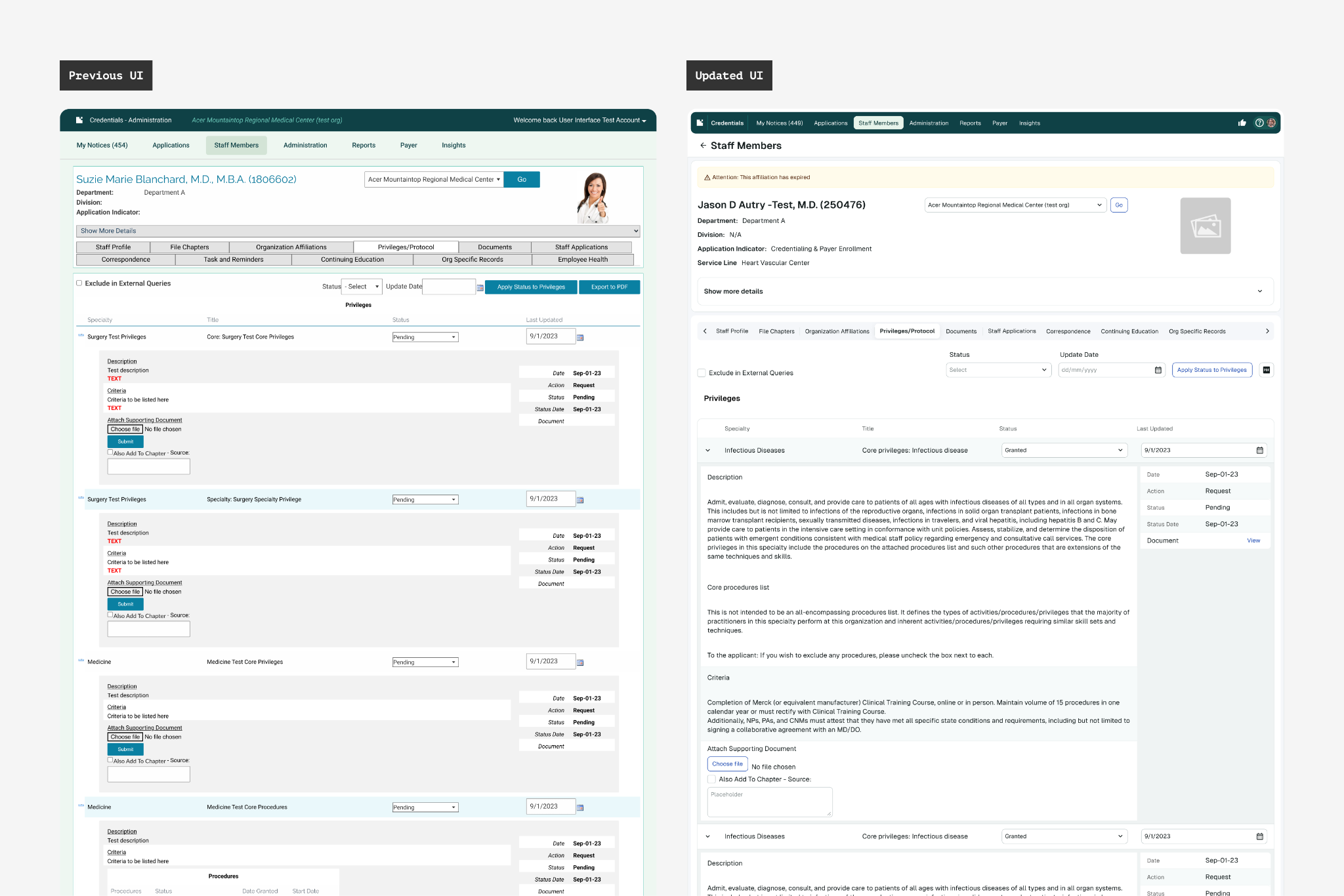
Improvement opportunities
As work progressed across the products, we identified opportunities to go beyond implementation, uncovering broader UX improvements. At the same time, we continuously iterated on and matured the Design System, ensuring it evolved to meet emerging requirements and provided the necessary flexibility.
As a result, fewer adjustments were needed over time, requiring little to no modification in the final stages.
Mobile considerations
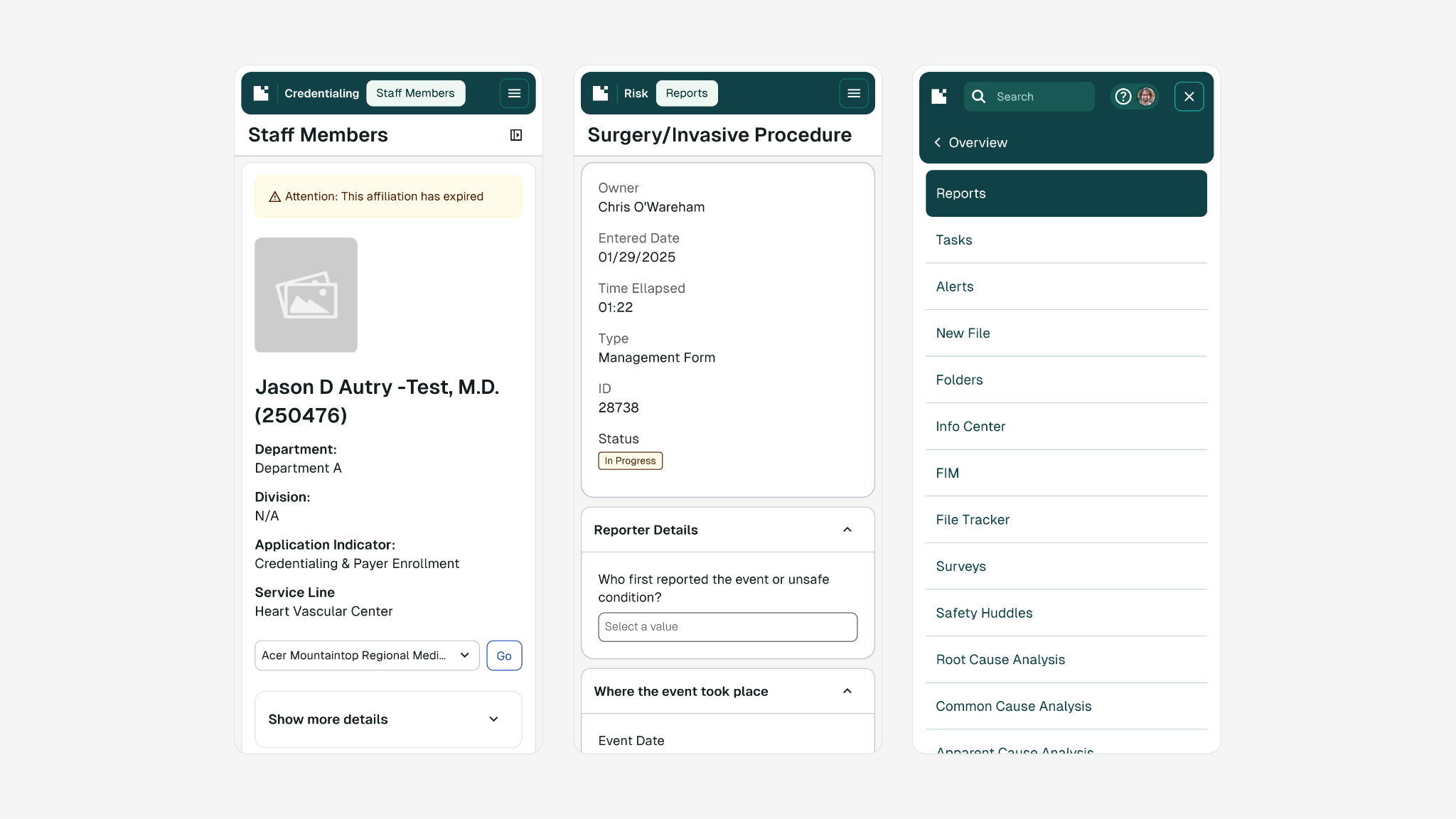
While the majority of products were desktop focused, with dense interfaces, some also needed to support mobile. This required extending the Design System to ensure appropriate flexibility, including updates to components such as larger touch targets and mobile-friendly navigation and menus.
Components such as buttons, input fields, and checkboxes were reviewed to ensure they were large enough for comfortable thumb interaction, while avoiding excessive scrolling. Best practice dictated a minimum touch target of 44px for interactive components.
At the same time, certain use cases required high information density to ensure critical data wasn’t missed, meaning that users needed to view large amounts of information at once while still interacting quickly and efficiently.
To balance these needs, we introduced mobile-specific variants for key components. For example, buttons included a dedicated “mobile” size alongside existing “small” and “medium” options.
Colourblind considerations
One of the key advantages of using a Design System is that accessibility, when built into foundations and components, can scale consistently across products. While the system met WCAG 2.1 AA standards, some product-specific contexts required additional considerations and exceptions.
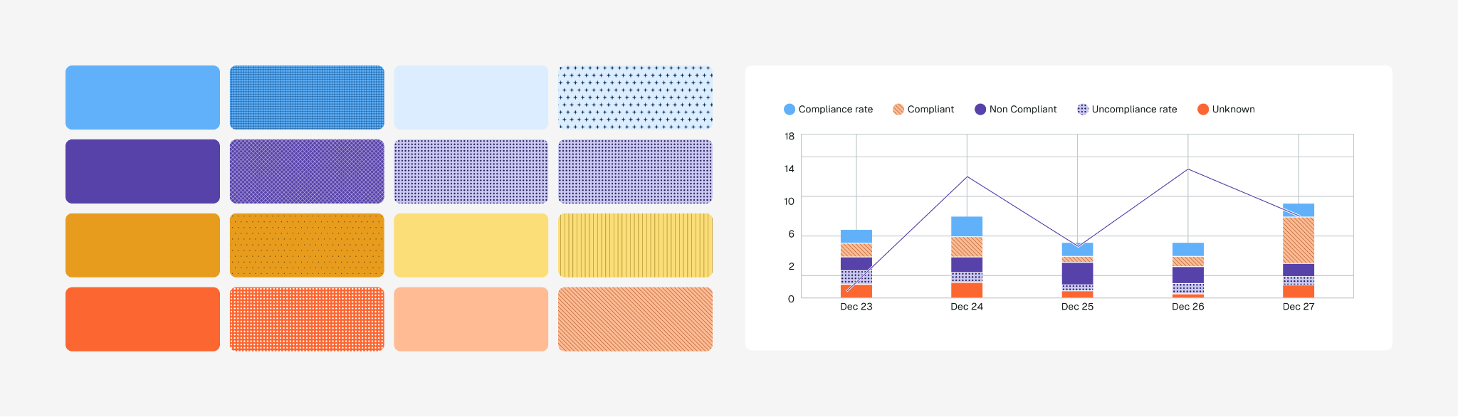
One of the clearest examples of this was the opportunity to move beyond using colour alone as a distinguisher for things like charts and graphs, and introducing colourblind friendly patterns, ensuring information remained accessible to users with visual impairments.
Managing custom components
The backbone of any Design System is its components, but their inclusion should be intentional. Not every component needs to be part of the core system. Given the breadth of products, some required highly specific components that were too niche for wider inclusion, yet still needed to be treated as reusable elements.
In these cases, components were created locally and carefully tracked. This allowed us to monitor reuse across products and reassess their inclusion in the Design System as patterns emerged.
The Deliverables
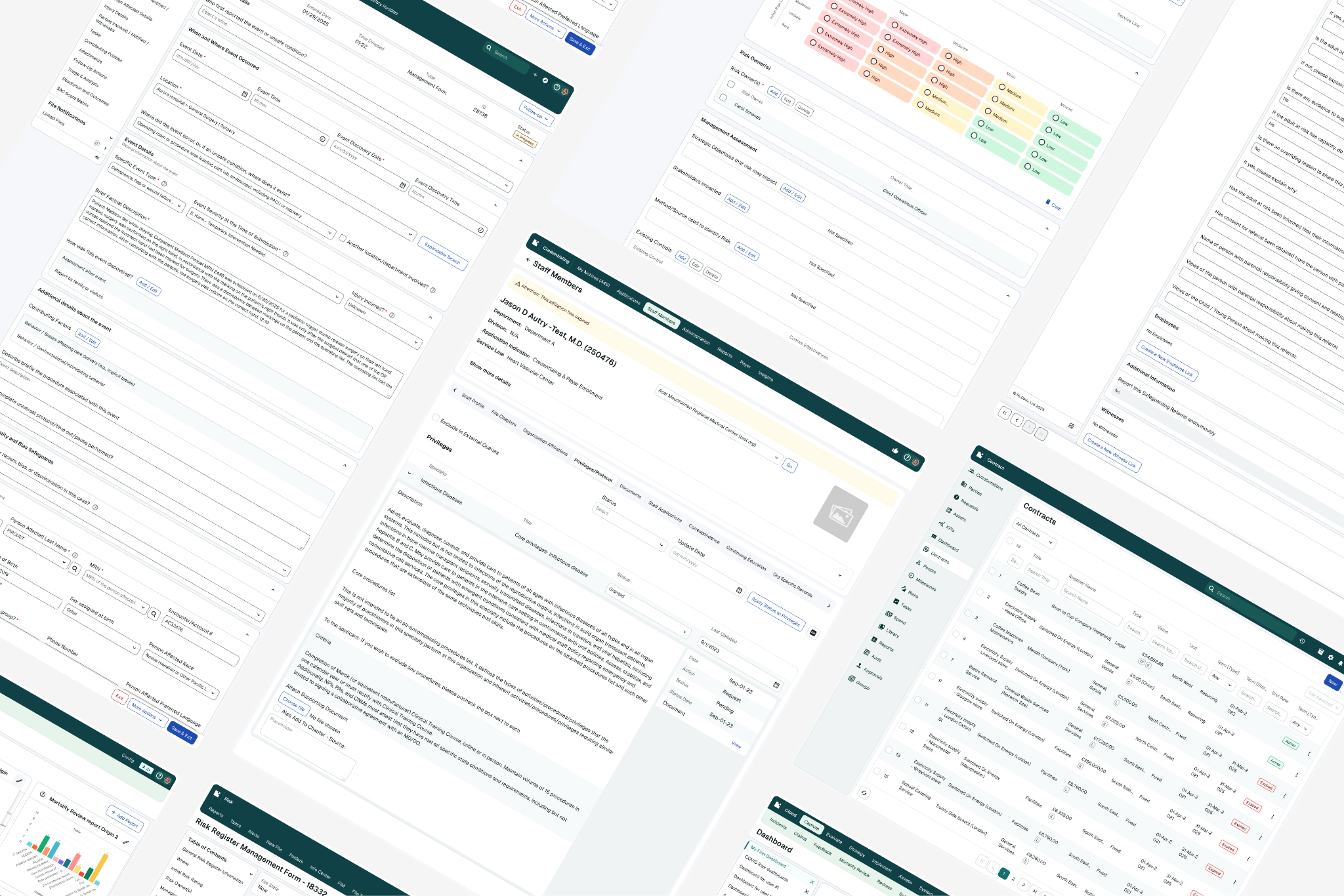
The six products, fully implemented with the Design System, were handed over to the wider client design team, giving both Product and Engineering a strong head start. This enabled them to plan implementation within their roadmaps, without design resource being a blocker.
Both the Design System and implementation work played a crucial role in increasing visibility across product areas and requirements, helping to break down existing silos. Previously, teams tended to focus only on their own products; the shared system implementation enabled them to see how components could be applied across different contexts, improving alignment and collaboration.
Before concluding the engagement, we ensured all work was handed over with comprehensive documentation covering accessibility, processes, and ways of working.
Closing the Engagement
As the YLD team departured, the client was left not only with a mature, scalable Design System but after this phase, also with clear examples of how to apply it across products. Consistent interaction patterns, improved visual clarity and streamlined workflows reduce friction and effort, making products easier to use and enabling more accurate data capture for the users.
Through a hands-on approach, we made sure the internal design team had everything they needed to confidently evolve the system and contribute improvements independently as we provided workshops, info videos and substantial documentation.
With a strong foundation in place, the client is now equipped to scale the system across new products, reducing design and development time through increased consistency and potential code reuse.


View More Work