The Challenge
Following the EdTech company’s major rebrand, various business units and product teams were expected to independently manage their UI implementations of the brand. To avoid inconsistent experiences and visual fragmentation, the brand needed a unified design baseline.
The Approach
Having already partnered on a design system for one of the EdTech company’s business functions previously, they brought us back to shape a new product toolkit with even greater reach.
To ensure that the EdTech company would gain the most value within the project’s timeframe, we kicked off with early alignment sessions, bringing key product and design stakeholders together to set a clear vision and shared direction from day one.
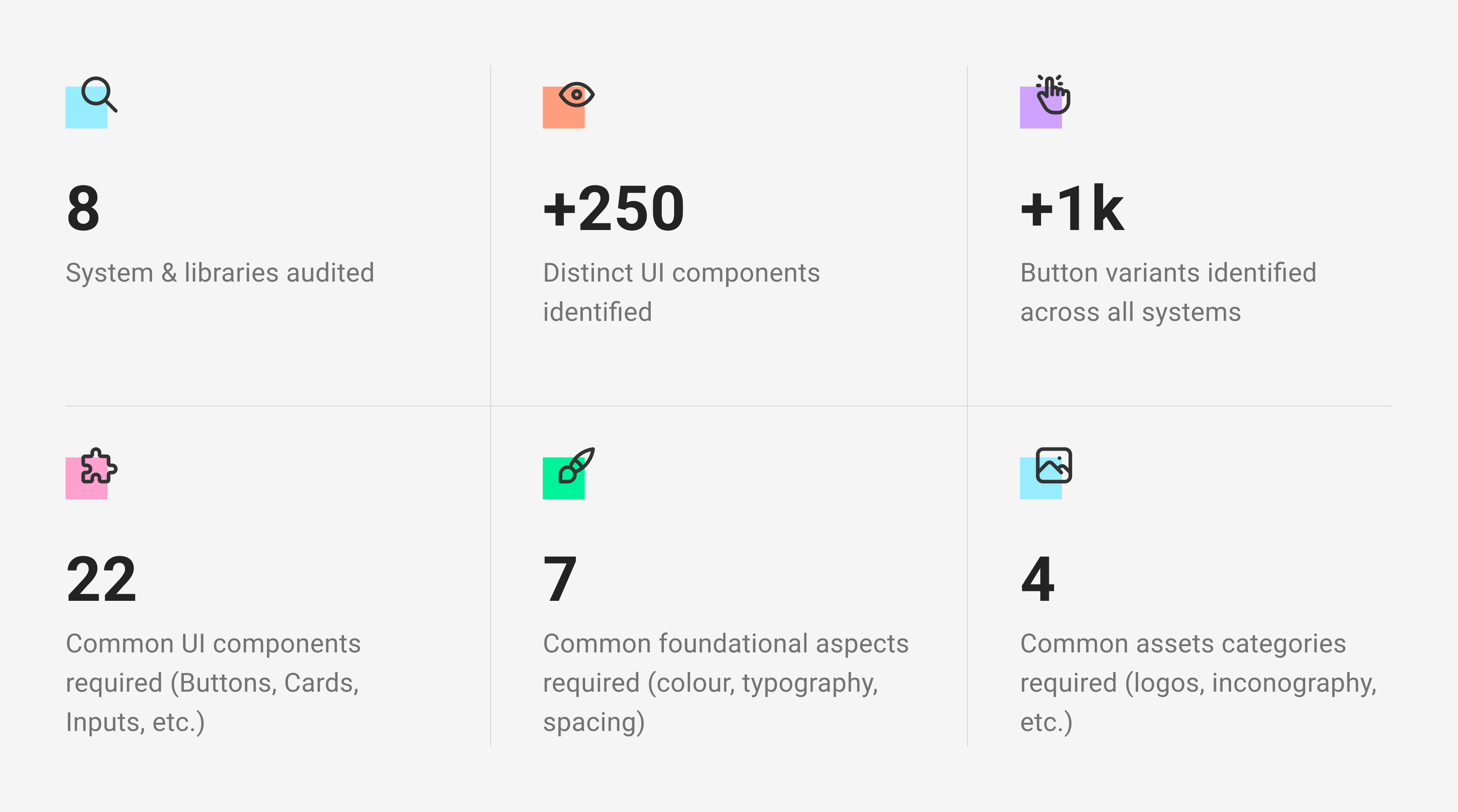
These conversations helped us understand how brand elements from the previous Design Systems were being applied across the EdTech company’s diverse range of products and services. We also conducted an audit to establish a clear baseline of how different teams structured their legacy files, naming conventions, and design tokens, as well as identifying components that could be reused in the new product toolkit.
Given the scale and diversity of the EdTech company’s offerings, it became clear that different design teams had adopted various Design Systems tailored to their individual needs.
While this approach supported team autonomy, it introduced technical complexity when implementing a unified rebrand across the organisation.
To drive adoption at pace without dedicated engineering support, we recommended that the foundations and components be independently developed and applied by each team within their existing Design Systems or component libraries. This approach enabled immediate progress while laying the groundwork for future consolidation into a single, unified Design System.
Through this collaborative discovery phase, we identified a key opportunity to improve efficiency and consistency by developing a centralised product toolkit.
Establishing objectives
The product toolkit was designed to serve as a central source of truth, enabling faster implementation of the new brand, providing clear guidance for design teams, and reducing duplication across the EdTech company’s extensive portfolio of products and services.
Its primary users include designers, developers, and product managers, who rely on it to build and scale digital products efficiently. Additionally, external vendors working with the EdTech company can use the toolkit as well to align seamlessly with brand standards, streamlining collaboration on future product initiatives.
Shaping the core of the minimal viable toolkit
After a comprehensive audit of the EdTech company’s existing Design Systems, component libraries, and most frequently used UI elements, we identified a clear starting point for a minimal viable toolkit.
Our approach focused on delivering immediate value while ensuring the toolkit could flex and scale alongside the brand’s future evolution and iteration.
We established that the toolkit would provide the EdTech company with the following:
- Comprehensive library of common UI components in Figma, designed to meet WCAG AA accessibility standards
- Ready-to-use brand foundations such as typography, colour, spacing, logos, icons, and more
- Complete variable system for light and dark mode, allowing for easy customisation for future theming and product iterations
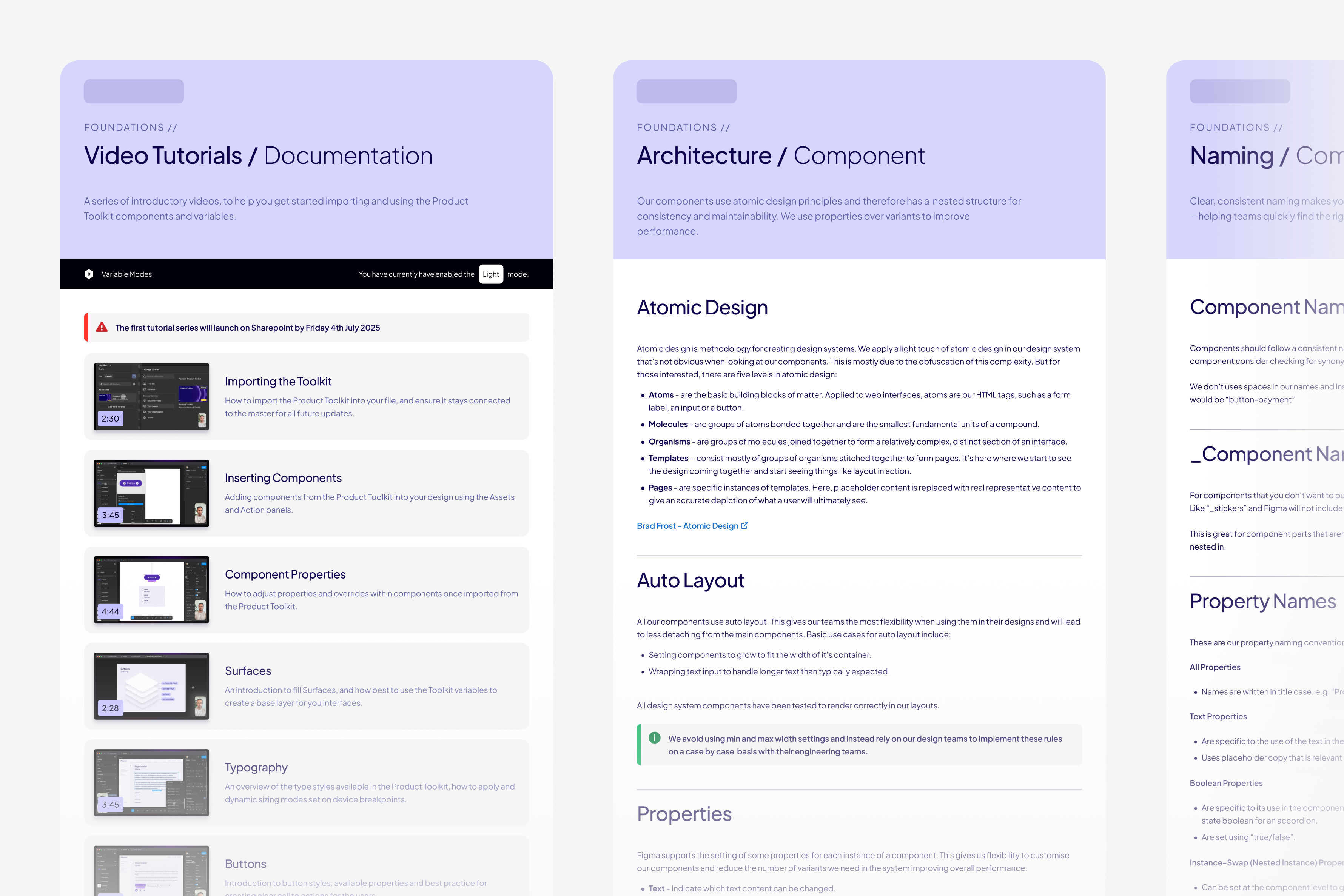
- In-depth documentation covering usage, patterns, and principles
- Comprehensive walkthrough video tutorials and guidance sessions
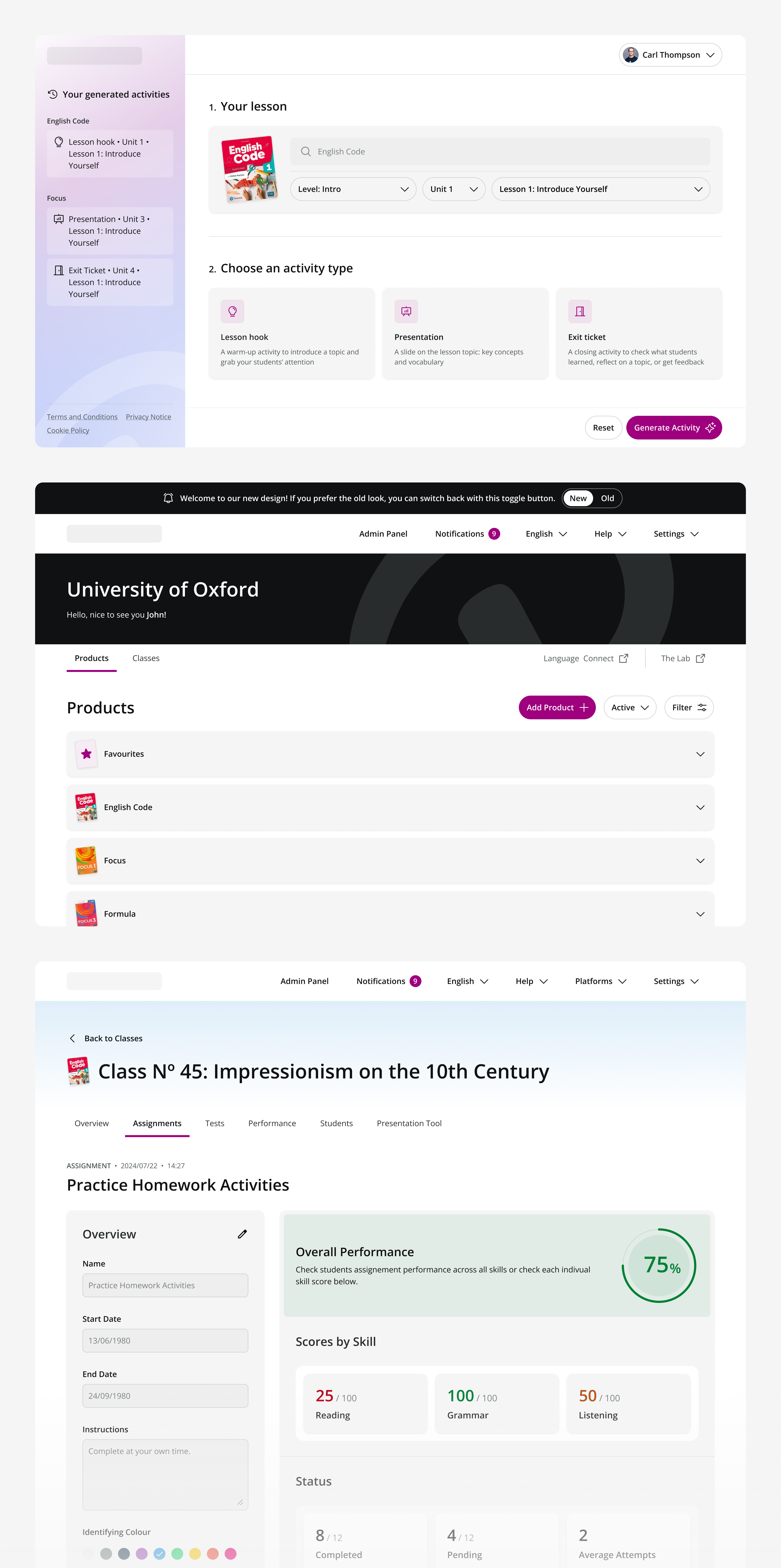
- Starting point example pages showing how to apply and use the product toolkit across a diverse range of products
Empowering diverse teams through a tailored, scalable toolkit
Given the broad scope of developing a minimum viable product tool kit, we took care to acknowledge the strengths of each of the existing Design Systems built by different teams across the EdTech company.
Each Design System had been thoughtfully developed to meet specific needs, which varied in terms of structure, maturity, and approach.
We also learned that many teams valued the ability to continue using familiar UI components and previously approved brand colours, emphasising the importance of flexibility in how the toolkit would be adopted.
To support a smooth transition, it was key to ensure that all design teams could adopt the toolkit at a pace that matched their workflows and current levels of design maturity.
With these considerations in mind, we built and delivered a tech stack-agnostic product toolkit designed to offer the flexibility needed to support the EdTech company’s diverse range of products and services, both now and as they continue to evolve.
Building the product toolkit from scratch allowed teams to retain creative freedom in expressing the EdTech company’s brand across different contexts, while still promoting consistency and alignment. The toolkit was designed to complement existing ways of working, enabling scalable, brand-aligned design without disrupting established workflows.
Building buy-in through clarity and collaboration
Given the EdTech company’s scale and the number of stakeholders involved, it was important to ensure everyone had a clear understanding of the purpose and value of the product toolkit from the outset.
We took a thoughtful, collaborative approach, tailoring our communication and support to meet the needs of both design teams and product leads across the organisation. We also facilitated dedicated design pairing sessions between YLD and the EdTech company’s teams to accelerate learning, strengthen team relationships, and gather valuable feedback for ongoing iteration.
Finally, through comprehensive documentation, in-depth presentations, and ongoing dialogue, we were able to build alignment, build trust, and ensure the toolkit would be embraced as a valuable, long-term asset across teams.
The Deliverables
To support existing team workflows, we provided a standalone product toolkit file that can be easily integrated into any in-progress design files. This approach ensures that foundational components and styles remain consistent, regardless of where or how various design teams are working.
For more bespoke needs, the EdTech company’s design teams can create their own product-specific files that reference the core toolkit, giving them the flexibility to design for unique use cases while still staying aligned with its brand foundations.
Closing the Engagement
Given the importance of a cohesive and structured rollout of the new brand, YLD's design expertise and cognisance of the EdTech company’s products and teams through previous collaborations played an instrumental part in successfully expediting its implementation. Beyond delivering the product toolkit at pace, we provided hands-on guidance and support to empower internal design teams, strengthening their autonomy, confidence, and alignment.
By equipping teams with the right tools, frameworks, and documentation, we enabled the EdTech company to scale consistent brand experiences more efficiently, while reducing reliance on external resources. This has helped ensure smoother, more scalable design and delivery.


View More Work