
Supercharging a Design System for cross-functional collaboration
The Challenge
Our Future Health sought to reinvigorate its Design System, which had become static, misaligned, and weighed down by design and technical debt, resulting in a fragmented user experience and internal duplication. This required consolidating components and design tokens, improving design/engineering parity, and establishing a scalable ownership.
The Approach
At the start of our collaboration, during the Discovery phase, our team wanted to establish a clear baseline before making any design decisions. We began by conducting a comprehensive audit of the existing OFH Design System by reviewing the Figma library and corresponding front-end implementation, assessing design-engineering parity, identifying potential component additions, and evaluating the current documentation approach and structure.
To ensure we were capturing the full picture beyond what the audit alone could surface, we facilitated 15 cross-disciplinary 1:1 conversations to understand perceptions of the Design System, the processes supporting it, and the technical and documentation considerations underpinning its use.
This discovery period gave us the evidence needed to prioritise what to fix and why. This stage in the project highlighted a number of gaps across design, engineering, and ways of working: Misalignment between Figma and code was leading to inconsistent components, alongside the absence of a shared front-end library and poor alignment between variables and design tokens.
In addition, documentation was outdated and difficult to contribute to due to technical barriers, further compounded by unclear ownership, limited cross-team collaboration, and low visibility of the Design System across the organisation.
Establishing foundations
To standardise core elements as part of developing a unified visual language, we aligned Figma and code around a shared, stable set of foundations. We standardised colour, typography, spacing, radius, and layout, ensuring experiences are cohesive, recognisable, and accessible at scale.
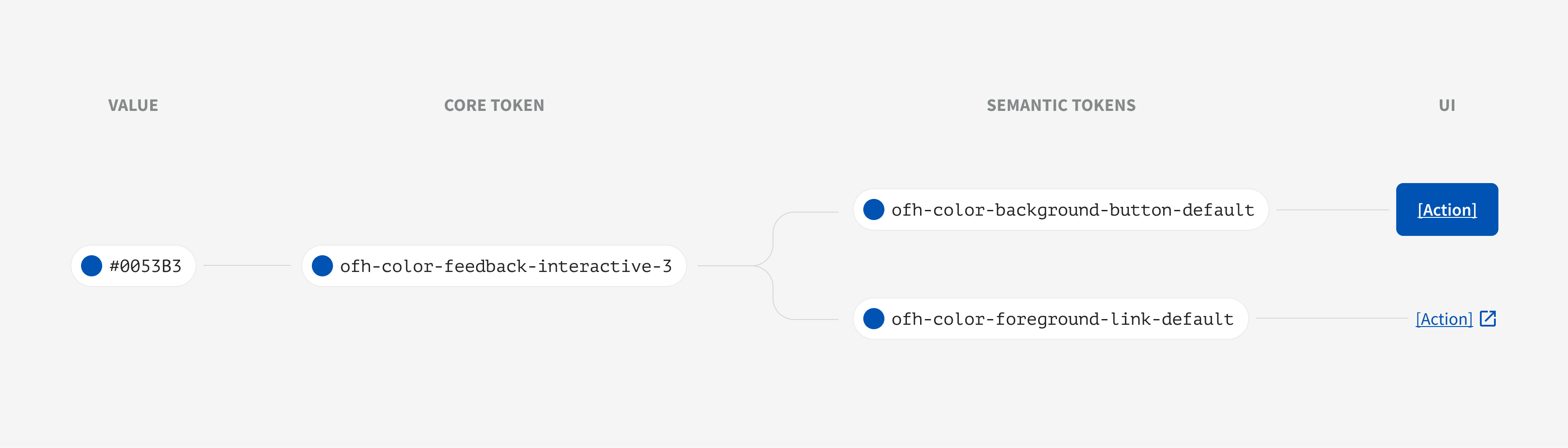
To create a strong alignment between design and engineering, these foundations were codified as variables in Figma and design tokens in code. This approach translated visual decisions into scalable building blocks that reduced the translation gap between design and implementation. By aligning token naming and values directly to the Figma model, decisions easily moved into code with less reinterpretation and lower risk of drift. This made parity easier to maintain as the system evolved, rather than relying on one-off fixes at the component level.
While variables and design tokens already existed, they were underutilised, inconsistently applied, and poorly structured. We reworked them with a clear, scalable naming convention and introduced theming, making them easier to understand, maintain, and extend, while enabling flexible reuse across platforms.
These improvements were then applied across all components in both Figma and code, marking a key step toward a unified, cross-disciplinary Design System with a shared language between designers and engineers.
To further support scalability, we restructured the system into a clearer monorepo model, establishing a single source of truth for both the core toolkit and a shared React component library. We also improved how the system could be packaged and consumed across applications, giving teams a more reliable way to adopt updates and validate them in implementation in production-like environments.
A component library rebuilt to last
With foundations in place, we turned to refactoring the existing components. These had been inconsistently constructed, often causing confusion and leading designers to detach instances or recreate them locally, resulting in duplication and inconsistency.
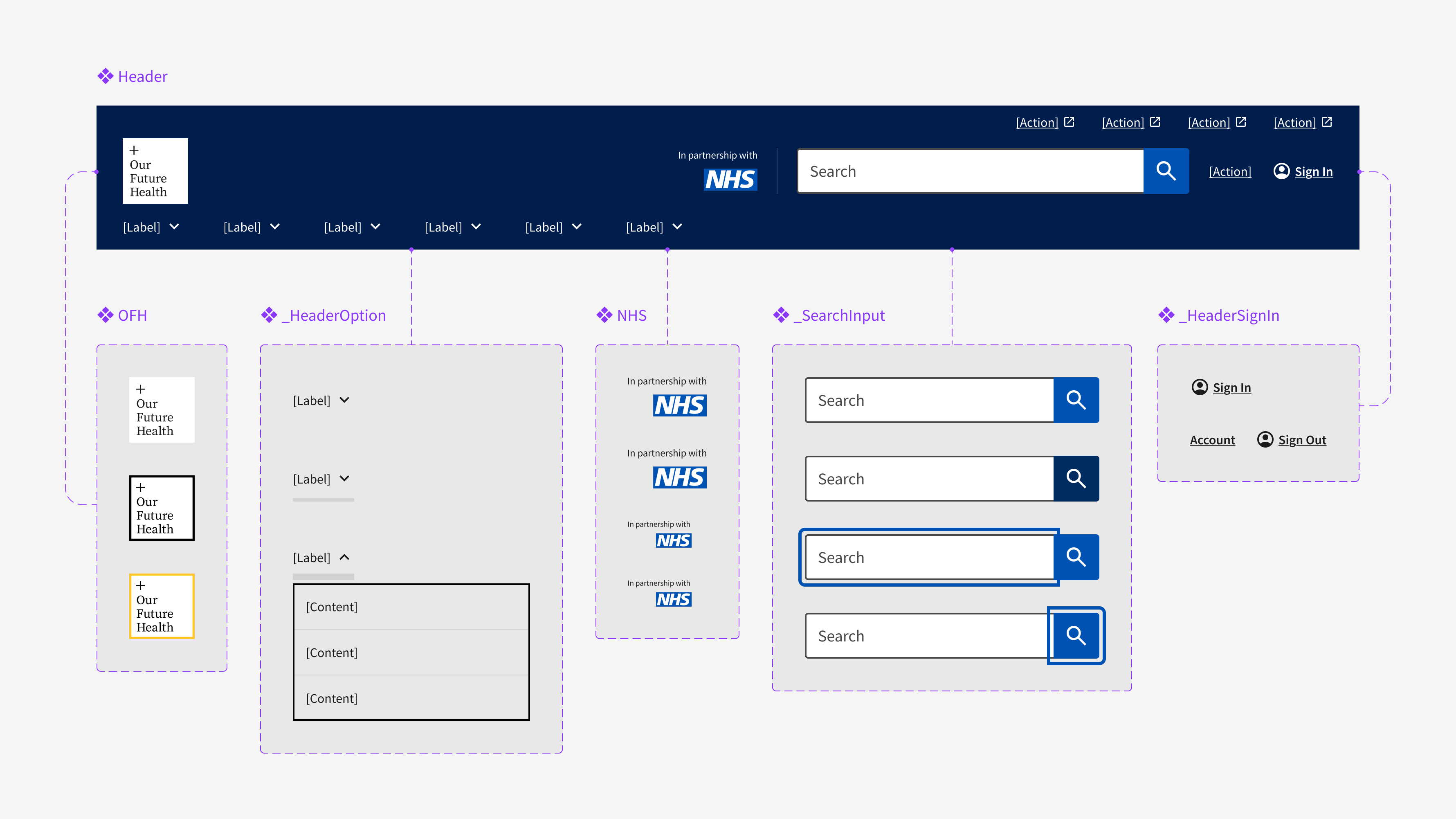
To improve system resilience, enable more efficient iteration, and reduce long-term maintenance overhead, we rebuilt the component library using Figma best practices, refining variants, introducing boolean and text properties, and standardising naming conventions. Alongside this, we adopted an atomic design approach, building modular components from smaller, reusable parts.
Alongside this, we expanded the Design System into engineering by introducing a React component library and integrating Storybook as an interactive environment to explore and validate components beyond static documentation, while continuing to support the existing HTML and Nunjucks setup.
Storybook provides a hands-on playground where stakeholders can test how components render and behave across different props and variants, improving confidence in usage. It also acts as a lightweight QA surface, enabling engineers to validate behaviour before and after changes.
Engineering parity extended beyond appearance. Interactive states, focus treatments, iconography, and error-handling behaviour were updated to match current design intent more closely, while Storybook and automated tests created a shared surface for validating accessibility and behaviour as well as visuals. This made parity easier to test and maintain over time, rather than relying solely on visual review.
By offering a shared, live reference of components, Storybook helps align design, engineering, and product around consistent implementation and usage.
Component additions to expand the system with intent
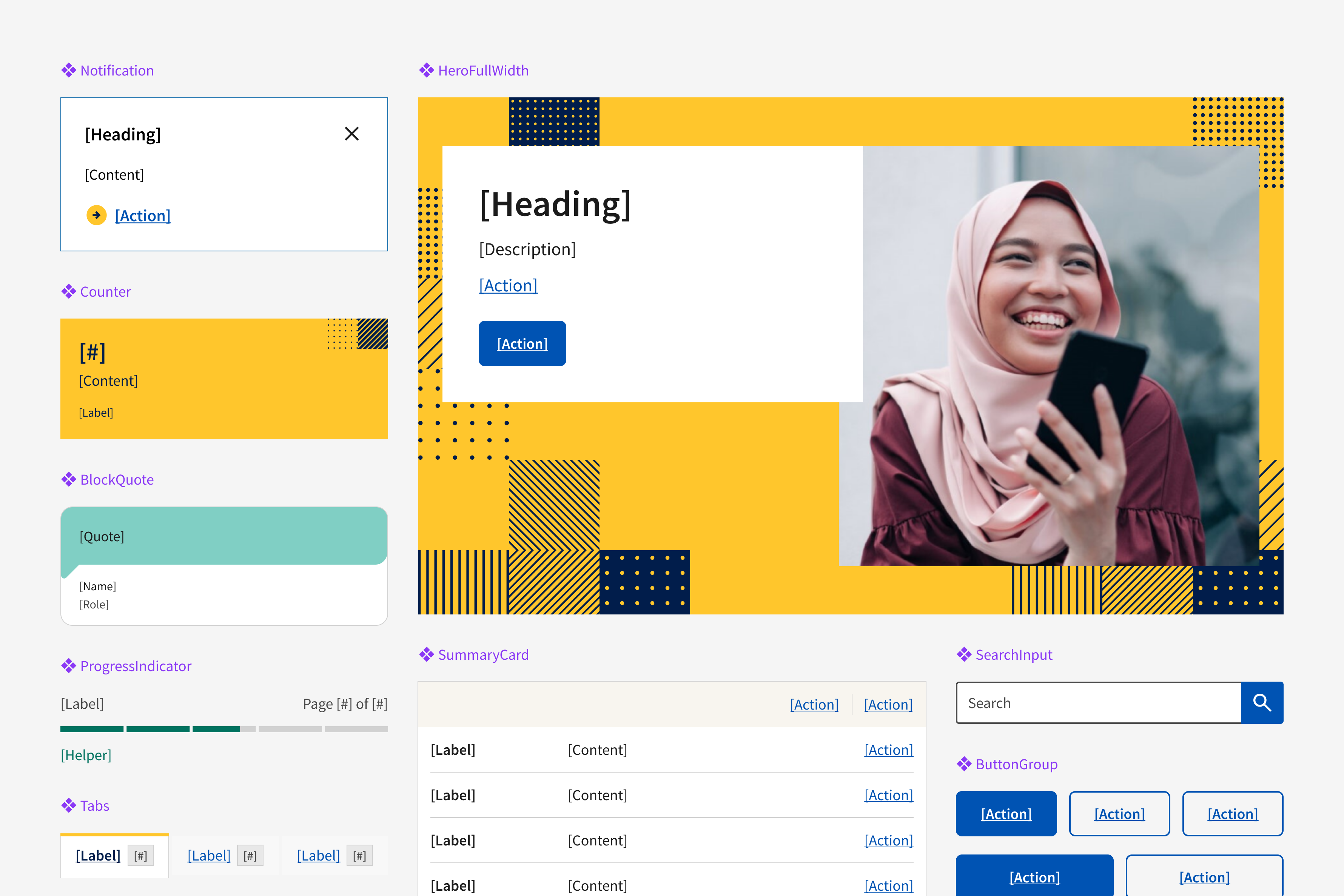
Keeping the Design System closely aligned with real user and business needs, we shifted our focus to identifying and prioritising new additions. Throughout the course of our initial Discovery, we identified and consolidated a range of potential additions to the Design System. Once we were ready to expand the system, we conducted a client prioritisation workshop, in which each potential addition was ranked based on the design and engineering effort required to deliver it vs the potential impact across various teams .
This resulted in 13 new components, 5 additional variants, and 2 new patterns being defined for inclusion.
To support these additions and enable a more scalable contribution model, we introduced branching in Figma, allowing changes to be developed in isolation so that iteration could happen safely without disrupting the core library. This approach also strengthened design and engineering alignment, giving both sides a clear process for reviewing, implementing, and merging work before it was published.
Making documentation work for everyone involved
The existing approach posed significant challenges, requiring front-end knowledge, slowing updates, and creating a barrier to contribution. As a result, documentation debt had built up, and risked becoming outdated.
To address this, we facilitated two workshops to define priorities, surface pain points, and align on structure and usability. Based on these insights, we evaluated tooling options and, as an interim step, migrated documentation to Confluence, ensuring content portability while introducing a more accessible, low-barrier environment for contributions, regardless of technical expertise.
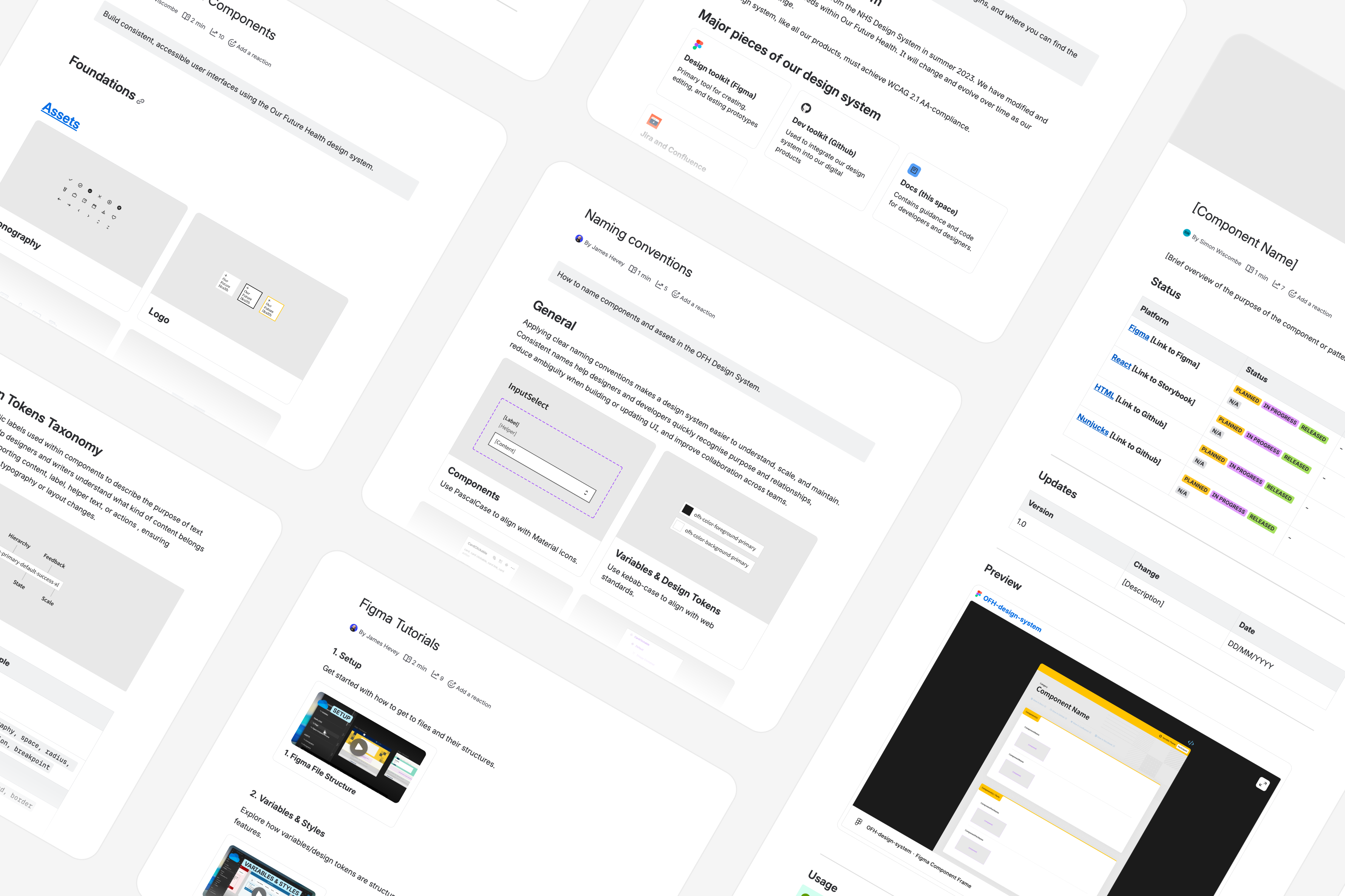
With consistency and scalability in mind, we established a standardised component documentation template and applied it across all new components and additions.
In parallel, we strengthened technical documentation within the repository to provide clearer guidance for both consumers and maintainers, covering installation, migration, theming, React usage, and improved practices around releases, versioning, linting, and contribution. Prompt workflows and migration guides further support consistent development, QA, and release processes.
Beyond components and foundations, documentation was expanded to support adoption and governance, introducing onboarding guidance, decision logs, naming conventions, reusable templates, and recorded tutorials. Together, these improvements create a more maintainable and contributor-friendly documentation ecosystem.
Ownership and workflows
To better support and scale the Design System, we expanded and championed the use of Jira to improve visibility, tracking, and cross-functional alignment. A centralised Design System board brought design and engineering into a shared workflow, enabling clear handoffs and transparency from design through to development, review, and release.
Working within a single system allows contributors and stakeholders to track progress, identify blockers, and maintain alignment throughout the lifecycle of updates. To ensure consistency and quality, we introduced structured Jira ticket types, supported by predefined templates that guide inputs, improve clarity, and streamline prioritisation.
We also established a more repeatable maintenance workflow. Structured prompts and templates guided teams through Figma analysis, token mapping, implementation, QA, and release readiness, making parity checks more explicit and laying a clear foundation for AI-assisted updates. This reduced manual effort for engineers while improving consistency across component updates.
Finally, we introduced a deliberate migration strategy to support these improvements. Where component APIs, naming, or tokens changed, updates were supported with compatibility paths, release notes, and clear migration guidance, enabling teams to adopt the system without unnecessary disruption. This ensured the system was not only well-defined in principle, but also practical to roll out across products and teams.
The Deliverables
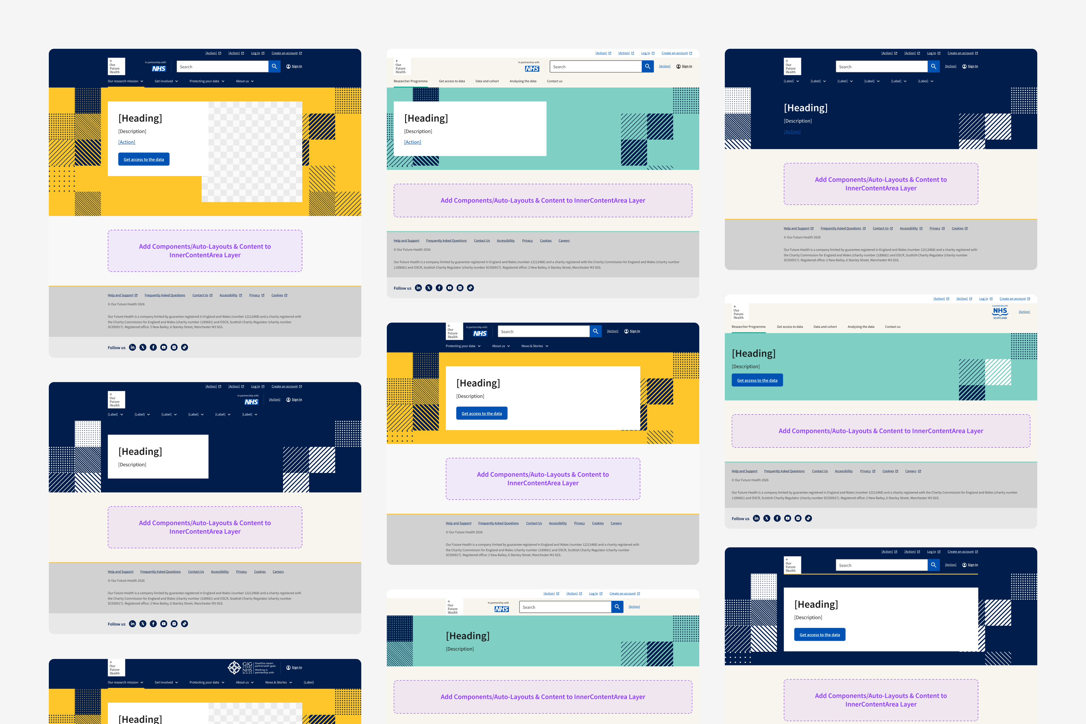
Though working with a tight deadline of only three months and a well defined, wide-ranging scope of work, our project management setup allowed us to deliver more than what was originally planned, thus adding value beyond OFH’s original expectations.
All new component additions were delivered across design and documentation, with the highest-priority components also implemented in the React library. In parallel, existing components, foundations, and design tokens were brought into parity across design and code, providing OFH with a strong, scalable foundation to build from.
We also began the process of cultivating broader ownership by establishing weekly rituals that bring together contributors from design and engineering to discuss updates, contributions, and the ongoing evolution of the Design System.
Closing the Engagement
As we reached the end of our engagement with OFH, it was important that we left their team with all the tools and skills they needed to be able to continue to evolve and grow the Design System beyond us. With that in mind, we prioritised knowledge sharing across design and engineering through onboarding sessions, walkthroughs, and short-form tutorials.
Dedicated sessions were run for both disciplines, helping engineers understand implementation and contribution workflows, while enabling designers to adopt improved Figma practices, including variables, component usage, and file structure.
Following the release of the rebuilt component library and design tokens, Figma Analytics showed strong early adoption. Despite introducing new components, the overall system became more efficient, with fewer components to maintain due to the shift to atomic design. Detachment rates in Figma were extremely low indicating that components are flexible, well-structured, and meeting user needs.
Early qualitative feedback from designers also points to clear improvements. Users report increased ease of use, faster workflows, and greater confidence, alongside more consistent outputs. While feedback is limited, the signals are positive.


View More Work